Multiple Sensors
Since my last post, I’ve installed multiple sensors and expanded my code (on github) to read and store the data. I’ve also set up a MySQL server on Google Cloud to store the data.
I’ll describe the hardware setup in another post, but what I’m really excited about is the data I’m able to collect now.
In this chart, I start with two sensors, and have 4 sensors running by the end of the period. Three interior, and one exterior:
The grey line (exterior), is aligned with the right axis.
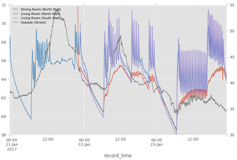
Notable points about the sensor locations:
- The orange sensor is under a large piece of furniture, a few inches off the ground
- This sensor is also in the same room as the thermostat
- The blue an purple sensors are at opposite ends of the living room
- The grey sensor is outside
It’s very easy to see when the heating system is on. The oscillations in temperature clearly show the heat cycling on and off, with an approximate mean of the thermostat’s target temperature.
Interestingly, the orange sensor is much less variable, and the mean of the oscillations changes slowly over time. This makes sense given its location close to the floor. The sensor is less sensitive to the immediate effects of the heating system, and is likely a better measure of average ambient room temperature than the sensors that are higher and less sheltered.
In an ideal world, I would want all of my sensors to be less variable, and perhaps look more like the orange sensor. The high variability in the blue and purple lines screams inefficiency.
Effects of Sunlight?
This is a really interesting chart:
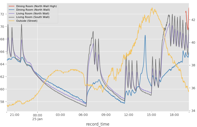
The most interesting thing that I see here is the spike in the blue line in the afternoon. The blue line is the sensor located in the dining room which has large windows and gets a lot of sun in the afternoon. In the summer this room would be very hot, and it’s not surprising to see the same effect in winter. The effect is so strong that my heat is off for about 2 hours as a result. The exterior temperature in the 40’s likely helped as well.
Changing the Thermostat
This chart shows the past three days of temperature readings from one of the sensors in the living room.
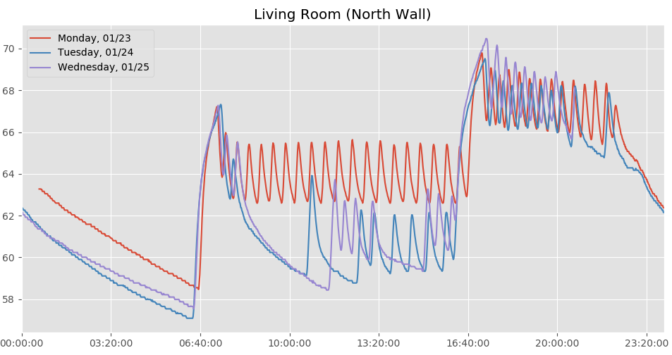
After collecting a couple days’ worth of data and seeing how variable the temperature in the living room was, I decided to turn the thermostat down a bit. The orange line is before the change, and the blue and purple lines are after. What’s interesting is that not only is the temperature lower, but the heating system can go long periods without turning on. I am not normalizing for a major variable, exterior temperature, which I will do in a future post.
-Dan