Finally, we’re on to the good stuff!
I left the Pi to collect data for a little while, and this is what I had when I came back the next day.
df['Living Room (North Wall)'].head(10)record_time
2017-01-21 18:16:22 65.8616
2017-01-21 18:16:33 65.8616
2017-01-21 18:16:45 65.8616
2017-01-21 18:59:37 66.2000
2017-01-21 18:59:49 66.2000
2017-01-21 19:00:01 66.2000
2017-01-21 19:00:13 66.2000
2017-01-21 19:00:24 66.2000
2017-01-21 19:00:36 66.2000
2017-01-21 19:00:48 66.2000
Name: Living Room (North Wall), dtype: float64WOOHOO!
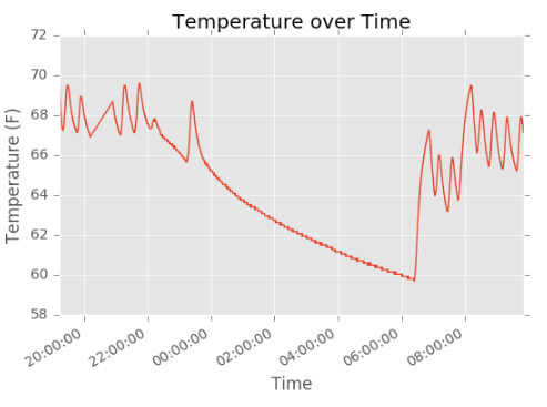
Plotting the data from the CSV file gives me some promising preliminary data.
You might have noticed a break in the pattern at the beginning of the chart, here:
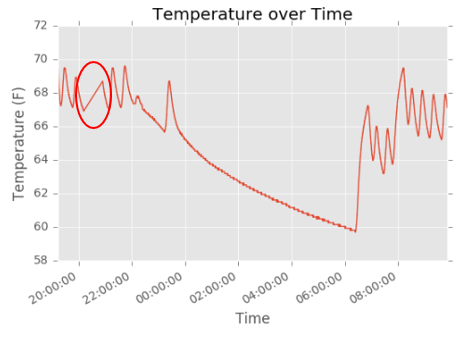
During that period of time, I had turned off the Pi to either debug something, move the unit, or rewire the sensors. Given that it would be a good idea to be able to handle missing data, I’m using a linear interpolation to fill in the gap. This is obviously not an optimal solution, so I’ll look into a better way to handle this in the future.
Subjective analysis
It’s worth spending a little time to really understand what we’re seeing in this series, and to that end it’s important to know a bit about my condo’s heating system.
- I live on the bottom floor of an old, three story building
- My walls are horse-hair plaster
- The windows are original (and quite leaky)
- My condo is heated via force hot air, and the furnace was recently replaced
- I set my thermostat on a schedule. It’s generally 68 degrees when I’m home, and 62 at night or when I’m at work.
Here’s a floor plan of my condo that I drew up a while back. The furnature is somewhat accurate, but the important thing to note is the locations of the thermostat (red), vents (green), and intake (blue).
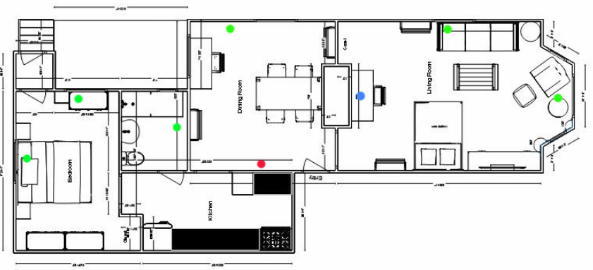
The Living Room (North Wall) sensor is located in the top right corner of the floor plan, next to the sofa.
With all of that out of the way, what are we looking at?
The oscillations in the chart are caused by the heating system overshooting its target temperature, and then waiting for the temperature to fall a certain amount before coming back on.
The long decline in the middle of the chart is night-time, when I’m asleep, and the thermostat is set to 60 or 62 degrees.
Then, the heat comes back on in the morning, and steps up a little higher during the day (this was a weekend).
What I found immediately interesting was that the condo can make it pretty much completely through the night without needing the heat once.
Additionally, the actual shape of the decline is interesting. The rate of loss of heat appears to decelerate in the period immediately following a period of heating. The is especially apparent after the last heating cycle around 11pm - 11:30pm before I went to bed.
It would be interesting to explore the relationship of the oscillations to the exterior temperature. I would guess that the width of the oscillations would be correlated to exterior temperature. I would also be curious to see changes to the second derivative of the line and the correlation of that with exterior temperatures.
I’ll follow up on these ideas, and some multisensor readings in a future post.
-Dan